Website powered by

Small Wins #2 - Houdini Small Projects

Making Of / 26 May 2021

Project 01: Procedural Nails

Nothing fancy here. 

First, I made a nail with Line and Sweep node. The transform node is to rotate it to the Z axis (for copy to points)

For the nail placement:
1. PointWrangle, to add N attribute
2. Just a group node using bounding sphere to group a part of the bat

3. Scatter points
4. AttributeRandomize, to randomize the value of N. I made it min -0.7, and max 0.7
5. PointWrangle to move the nails outside and inside the bat
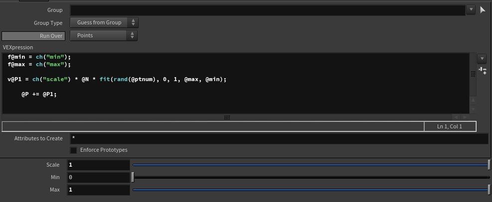
a. Create a public float variable, in the form of a slider min and max
b. Create a new vector variable P1. We will add the original P attribute with this. So P1 will be randomized.
c. In this expression, we use ptnum for random, and fit it based on max and min variable. We multiply that by N too so the nail will move perpendicular to the bat. A channel scale was made for overall strength control.  


Project 02: Procedural Bandage

Michael Elton teaches me how to make this (https://vimeo.com/eltonwidjaja)
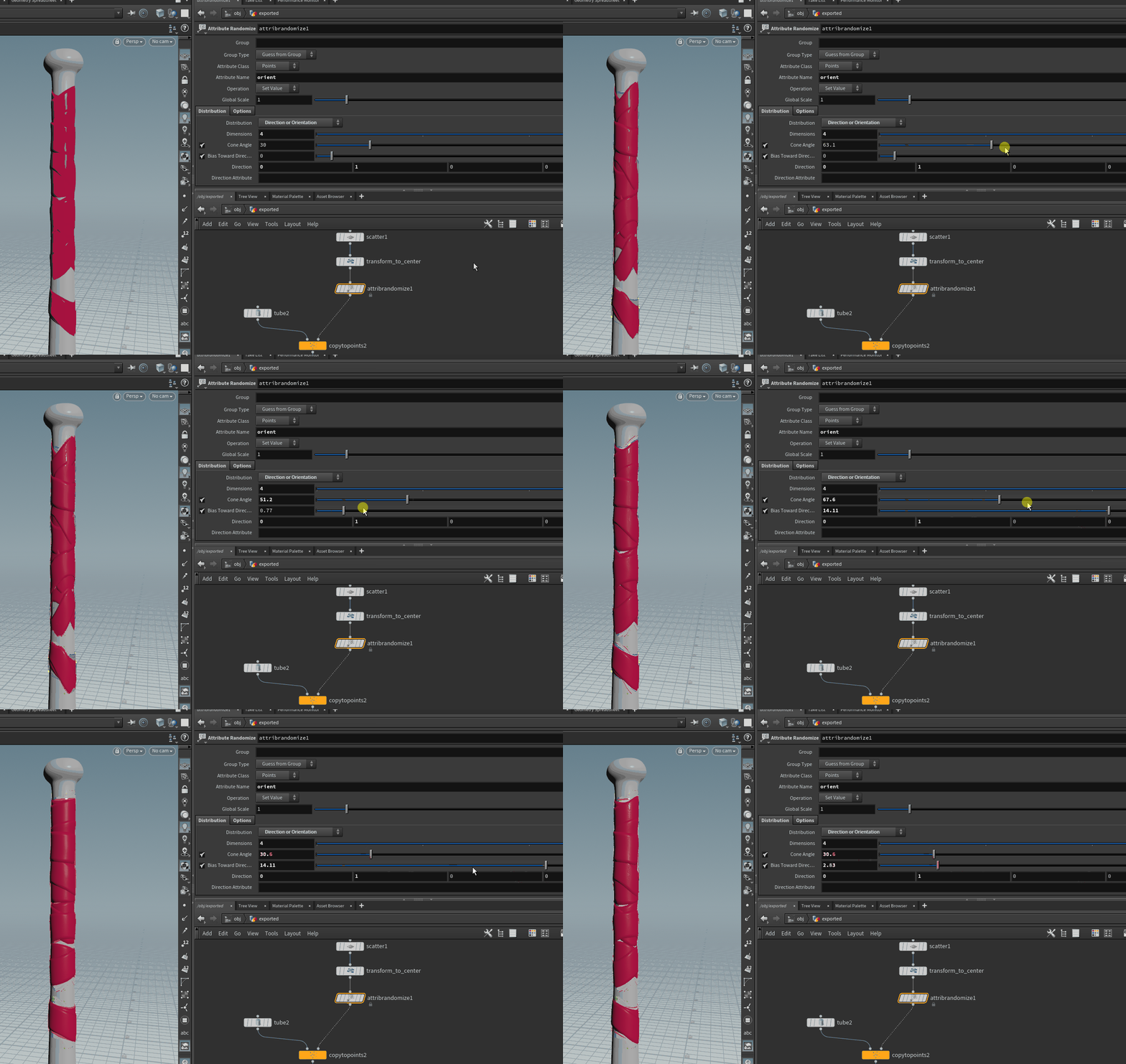
The key concept is actually very simple.
1. Make a group of selected Primitives
2. IsoOffset, to make it into a volume
3. Scatter points
4. Transform points to center (just scale 0 for x and z axis)

5. AttributeRandomize orient attribute (by default, point have it already). Change the distribution to Direction or Orientation. By default you will have this variable to adjust:
     a. Cone Angle
     b. Bias towards direction
So far this is the easiest and most powerful orientation control. For simple stuff, randomizing the N is enough, but for extra control this is very useful. 

6. Connectivity node: to make an attribute called class. When using forEachConnectedPieces, this is necessary. By default, this is what you get when creating a forEachConnectedPieces node


7. Inside the for loop, we want wrap it, extrude, smooth, add UV, etc etc.
The ray base mesh is the one that we change based on the forloop feedback.


8. Elton also teach me how to make a wrinkle map too by using a difference between 2 Measure node, before and after the ray (wrap) node. 

Using AttWrangle to calculate that: f@area_diff = f@orig_area - f@wrap_area;

Then using pointVOP to add to the P attriibute (multiplied by the ramp created by the difference of the area)

But this is not necessary for simple blockout of bandage. Very cool tho.


New Nodes:
1. For Each Connected Piece (for feedback)

I use this to wrap each individual primitives (each bandage).

Important things to change:
a. Gather Method to Feedback Each Iteration. This is so that every new bandage will collide with the previous bandage.
b. Foreach_begin2, change to Fetch Feedback. This is so that the next input is the previous forloop result.


2. Switch Expression: if(detail(-1,"iteration",0)==0,1,0)

If iteration is 0 (first bandage) use the second input (1). If it's not 0, use the first input (0, foreach_begin2)

This expression is my first try out on Spare Input in Houdini. What I understand is that you can use spare input to insert an attribute from other nodes, which is often used in ForLoops, to create variation. In this case I'm using it to choose either project only to baseball bat, or the previous Feedback iteration from the foreach_begin input node.

Inside the spare input is the Meta Import node, created from for each_begin node.


3. IsoOffset: basically dynamesh into volume

4. Connectivity: return an attribute, with unique value for each connected pieces.

5. Ramp (VOP): create a ramp parameter, to adjust the value of the input (photoshop curve basically)


Project 03: Procedural Rope

I'm following this tutorial from Simon https://www.youtube.com/watch?v=RyA7JboNTT0&ab_channel=SimonHoudini.

I also learn how to use the sweep node to create a simple rope easily. Very easy! But I foresee that I'm going to use this a lot in the future.

New Nodes:
1. ShrinkWrap: make a bounding box around it, with simple geometry. It follows the shape more closely unlike Bound.
2. Poly Path: convert polygon edges into polygon curves! Making multiple primitives into 1 primitive.

3. Sweep: from curve to polygon, or more curves. Very powerful.


Project 04: Metahuman Batch Map Transfer

In the middle of making Project: Aubrey, Epic Games release their MetaHuman sample files. I decided to steal their texture: cavity map, animated albedo, and animated normal map for my character. 

I did this to understand how their shader works, especially to understand wrinkle mapping workflow. Although in the final render the wrinkle map is not very obvious, I enjoy making it work on a technical level.

1. Use ZWrap to wrap DAZ3d head model to metahuman model.
2. Transfer UV from metahuman model to DAZ 3d head.
3. Transfer textures from DAZ 3d head (metahuman UV) -> DAZ 3d head (original UV) in Houdini
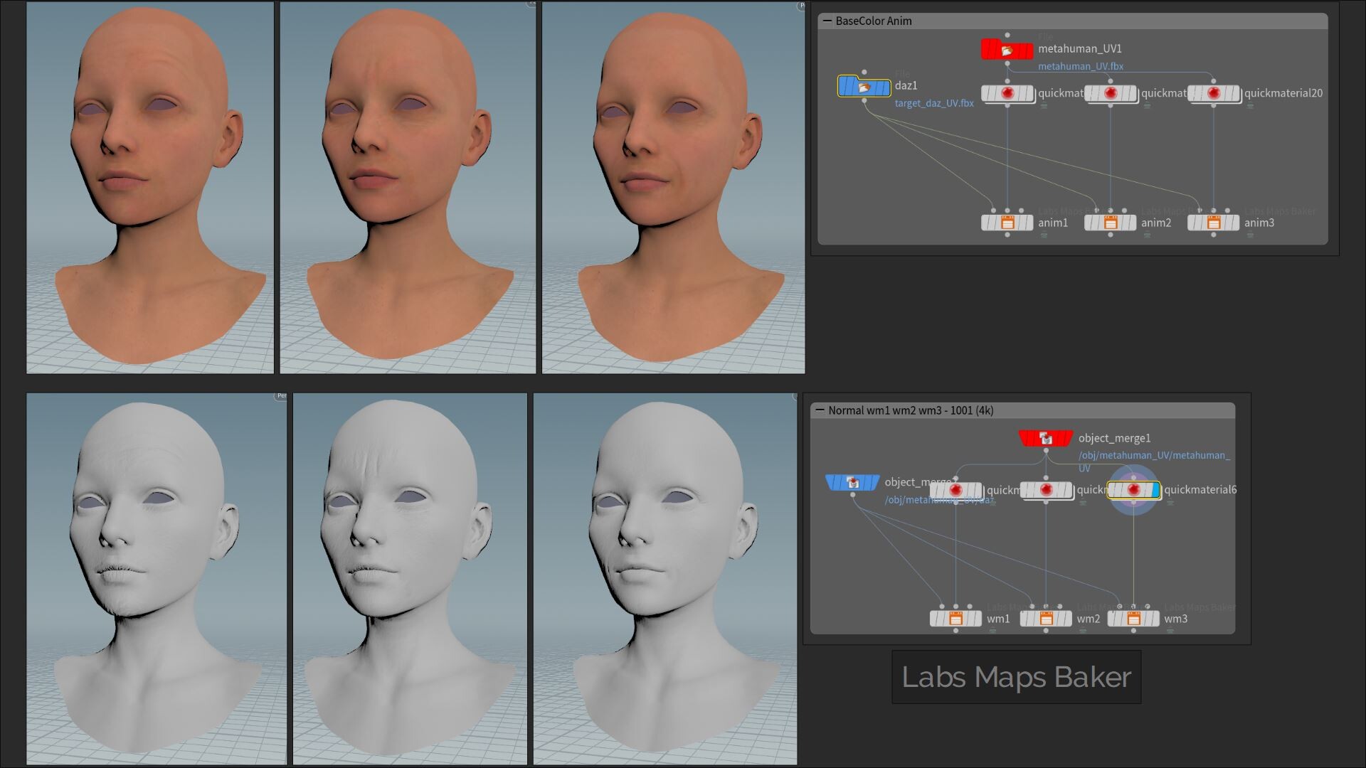
4. Then I try to merge the albedo in substance for base albedo, albedo wm1, albedo wm2, and albedo wm3.
5. Then I import all the necessary texture to UE4

Implementing these texture is bit complicated in UE4, mainly because I used Virtual Texture so I can use UDIM. Also by default the MaterialFunction for blending the Wrinkle Map have the texture object built inside them unchangeable. In the end I duplicated every MasterMaterial and MaterialFunctions in MetaHuman, and modify it with my own texture.


Project 05: Making Marvelous Designer Simulation Looping

For Project: Aubrey I need a cloth simulation abc file in ue4. To optimize file size, I only make the abc goes on for roughly 300 frames, on the condition that the last frame flows seamlessly to the first frame.

1. The first Timeshift is to change the first frame pose.
2. The second timeshift is simply  'last frame number' - $F.
    This is so that the last frame (timeshfit2) is the exact frame before the first frame (timeshift1)
3. I add blendshape with 2  keyframe that blends the first timeshift node, with the second timeshift node. I play around with the position of the keyframe to make it as natural as possible.

4. Timewarp is just to slow down the animation.
5. Another blendshape because I only want to slow down the cloth sim on certain parts of the animation.


Project 06: Stylized Tree from Houdini in UE4

I tried to follow this tutorial by Kris from Lucen, an Indie Game currently on development (https://www.youtube.com/watch?v=BeRjyj2Xhtw&ab_channel=Kris-LucenDev). No too long ago, Kris also released his tree material for free (https://www.youtube.com/watch?v=I9oTupdnSgk&t=4s&ab_channel=Kris-LucenDev). So naturally I downloaded it and try to create my own tree.

The tree that I made in Houdini with Kris' material. The shape is very ugly because I just anyhow play with the parameter. 
The tiling of the trunk is also wrong

This is just a small exploration I did with SideFX Labs add-on in Houdini and my first encounter with a vertex-animated shader.

Object level Node Graph


QuickTree node from SideFX Labs. Red color SOP is adjusted SOP or added SOP


I tried the shader with custom tree I bought from the unity Asset Store too (https://assetstore.unity.com/packages/3d/vegetation/story-northern-nature-164556 and https://assetstore.unity.com/packages/3d/vegetation/the-illustrated-nature-153939). It was on 50% sale, so I just bought it. This asset will act as a constraint for my next projects

The tree moves along like the one inside Lucen DevLog. The UV is different tho, so some of the branches is floating now. Need to fix this.

New Nodes:
1. Bound: make a bounding box/sphere
2. Ray node: with minimum distance, this project all the points to the target. Like projectall in ZBrush, but better, especially for low-res geo.
3. Peak node: basically inflate
4. Cluster node: this plus Color with Random from Attribute setting is a powerhouse. Promote this to a primitive attribute, and you get yourself a primitive cluster!
5. matrix 3 for adding rotation to the leaves obj. We make a float r variable, which contains a random number based on ptnum. I will not be able to memorize this lol
6. AttributePromote: I use this to promote the Normals from point to vertex.
7. Switch: the same like ue4, but with more option because it could be more than 2.

8. Getting more familiar with CopyParameter, and PasteRelativeParameters.

Making of "Dr. Rhonda Patrick Here!"

Making Of / 01 October 2020

Hi everyone, today I want to share my process on making my latest project "Dr. Rhonda Patrick Here!", one of my favorite project I have ever done. This project took around 2 months, and I learnt so much during that time.

Final Render: https://www.artstation.com/artwork/18EQOK
Technical Breakdown: -coming soon-

Beauty Shot

Big thanks to Li Jinlong (https://www.artstation.com/lijinlong1989) and Levinna (https://www.artstation.com/angelitalevinna), for helping me with the likeness of Rhonda, and Hugo (https://www.artstation.com/hthung_mkiii) for teaching me how to do face-oriented vertex normal baking and more baking RnD. 

Special thanks for Michael Elton (https://vimeo.com/eltonwidjaja) who helped me with the Houdini sides of things in this project.

Who Is Rhonda Patrick?

One of my favorite things to watch is wellness/health/longevity related videos. I also love listening to podcast when I'm working, and health related podcast was at the top of my list.

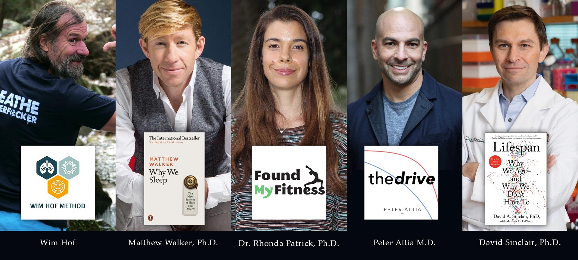
Some of my favorite people to talk about health and longevity

Dr. Rhonda Patrick is a Ph.D in biomedical science and expert on nutritional health. I found out about Rhonda Patrick from Joe Rogan Experience (JRE) podcast when Levinna told me about her. After I listened to one of her podcast I simply couldn't stop at one. She is immensely fun to listen to, and more importantly she is able to explain seemingly complicated science stuff in an easy to understand manner. She also has a website/podcast: Found My Fitness (FMF) (https://www.youtube.com/user/FoundMyFitness and https://www.foundmyfitness.com/)

In fact the phrase "Dr. Rhonda Patrick here!" is a reference to her opening phrase in every FMF video!

I get to grow my own broccoli sprouts because of her

Rhonda Patrick is pretty well known for loving broccoli sprouts, for it's high content in sulforaphane. I am not going to explain why it is amazing for your body, just watch this video made by Rhonda itself: https://www.youtube.com/watch?v=zz4YVJ4aRfg&ab_channel=FoundMyFitness

One morning I just came up with an idea to make a stylized version of Rhonda Patrick. It is going to be my very first stylized likeness project. From the start I wanted to integrate her fun personality, her science, and her passion for broccoli sprouts, all into a 3d character.

Base Body

As this is a likeness project I have to really pay close attention to Rhonda's face while sculpting. The body, however, is something that I took creative liberty in. I am going for something stylized with realistic texture and rendering.

Very early test render in Arnold (later switched to blender cycles)

As you can see I am struggling quite hard on getting the face right. It looks very different when I finally put it in Arnold for a test render compared to ZBrush viewport render. I am trying to balance a stylized look while maintaining likeness. Rhonda has a very pronounced jaw, making her smile something very appealing to see. I consider doing something hyper-stylized like a caricature would, but I decided to make it a bit more grounded to reality. 

Eve Underground Project (WIP)

The base body was re-used from one of my postponed personal project. This base body is from a character I am trying to create based on Eve's music video (https://www.youtube.com/watch?v=nBteO-bU78Y&vl=en&ab_channel=Eve). I replace the head, re-UV, and re-bake the base body into one single mesh. I start this project even before "The Death of Marat", but I decided to postpone it for various reasons.

Cloth Creation

Rhonda Patrick in a lab coat

I found this picture of Rhonda in a lab coat, and I immediately know that this is going to be my cloth starting point. I just need to apply a more smart casual feel on it.

I used Marvelous Designer for basic cloth making and ZBrush for the detailing. Specifically for this project, I didn't really adjust nor add additional folds information in ZBrush. All the folds in the cloth came purely from Marvelous Designer. Additionally, I use ClayPolish to make the folds slightly stylized.

Most of the seams was made by masking the edge, and inflating the mesh slightly. I didn't do much manual sculpting at all for this project. I can get away with this because I can exaggerate the seams, as it is a stylized character.

Retopology was done in Maya

In this project I did some practice with my retopology, especially with clothing. I pay extra attention on keeping the topology matching to the base body topology, keeping the silhouette of the cloth, adding extra edgeloop where it is necessary, and capping the model in some parts. A lot of this topology tricks I learnt at work.

Houdini Broccoli Sprouts

Houdini Viewport of Rhonda's Broccoli Sprouts

Broccoli sprouts is the hero props for my character, and I think it is a good subject matter for me to try and learn Houdini. Houdini is probably the strongest 3d software in the world right now. Learning it will enhance my workflow in future project. Making broccoli sprouts seems like a perfect entry level Houdini project.

Needless to say, I am very inexperienced with the software. Shoutout to Michael Elton (https://vimeo.com/eltonwidjaja) again for personally teaching me the initial framework needed to make this asset.

Technical Breakdown Coming Soon!

Nevertheless, I still want to share a few things I learn from making this object in Houdini. More details on this step will be explained in my Technical Breakdown of "Dr. Rhonda Patrick Here!", coming soon in future Artstation post. The format is going to be similar to Project: Xu Breakdown (https://www.artstation.com/artwork/2xNNYB). I will try and make it simple and easy to digest.

Additional Props Making

At first I didn't plan on making any other props for this character. However after I finished texturing the cloth, the character feels really dead. It doesn't have personality ;)

Additional Props (EEVEE)

So I decided to integrate some accessory to the character. The Apple Watch, beads necklace, and ring is from Rhonda Patrick's actual accessory. The pen and the name tag is something I add from my own reasoned choice. 

The biggest impact I got from all these additional props is the asymmetry it creates. I purposefully make some of the props very detailed. The goal is to create a detail-rest-detail-rest rhythm in the character. The pants and the lab coat doesn't have a lot of detail anyway so it is pretty much a blank canvas waiting for stuff to be put on top.

Rhonda's Handbag (EEVEE)

The handbag is also something that I have a lot of fun with. I spend quite a lot of time trying different proportion, location, style, and pose. In the end I put priority on these few things:

1. I want the bag to have a straight leading line to the face.
2. Golden metallic material for capturing the light.
3. Something to break the silhouette of the bag.

In the end I am very happy with how the props ended up affecting the whole character. The more you go up to the face, the more props and detail the character has. Hopefully this helps to direct the viewer's attention to Rhonda's awesome smile.

Rhonda's Awesome Smile

Texturing Skin

I tried a new workflow for texturing the skin. Mainly, I simple followed these 2 guides:

1) [Guide] Detailing skin with Texturing.xyz multi-channel faces, Blender and Zbrush
https://www.artstation.com/artwork/rA9A1a

Projection Mesh in Maya and Projection Texture Result

Rather then projecting 2d texture on top of a 3d model, this workflow did the reverse. You unwrap the 3d model into 2d information (UV), and then you wrap around the UV around the texturing.xyz multi-channel face texture. The guide use blender, but I use maya.

For the projection, I just use xnormal so I can project all the maps easily.

2) Saurabh Jethani / Creating realistic skin in UE4
https://texturing.xyz/pages/saurabh-jethani-creating-realistic-skin-in-ue4

This entire guide is a blessing, please do read the entire thing if you are interested in realistic skin rendering, realtime or pre-rendered. I tried to recreate his setup in UE4 in blender shading editor.

Substance Painter Skin Channels

I made the extra maps for the skin in substance painter with custom user channels. On the bottom right, micro skin tiling maps from texturing.xyz which I used in the shader level.

Texturing Props

Texturing the props was very straightforward. One thing I try to do differently is on the baking side of things. Shoutout to Hugo (https://www.artstation.com/hthung_mkiii) for teaching me "face oriented vertex normal" method of baking. It is something that I never did as a character modeler.

Rhonda's Name Tag vertex normal + baking result

The main thing is that you want to orient your vertex normal based on the face normals. This works best if you have a bevel on your low poly object. This results in a very clean normal, which you can see from the completely flat normal map color in flat area. If you just soft edge the lowpoly, you will have dirty gradient on your normal map that doesn't provide additional details.

While texturing the props, I put extra attention to make sure there are variation in roughness map, and gradients in the color map. Just using these 2 simple things will usually get you 80% of the texturing job done.

Grooming

Rhonda with 2 different hairstyle

I wanted to make 2 hairstyles: a more professional hairstyle, and a more casual one. In the end, I settled on a long hair and a ponytail hairstyle based on the 2 reference picture of Rhonda above. The hair really helps to convey the personality of the character. I particularly  love the rim light on the face on the ponytail hair render.

The last time I try to make eyebrows and eyelashes was on my Andy Serkis likeness project when I was still a student. So this is my first attempt at making eyebrow and eyelashes in XGen IGS. 

Mesh Eyelash vs Groomed Eyelash

However, during this project I decided to just use a mesh for the eyelashes. I did make a groomed  eyelash but the result was very terrifying.

Mesh Eyebrow vs Groomed Eyebrow

The groomed eyebrow however seems pretty fitting. The only thing I did different was I make it very solid, so it doesn't look out of place like the groomed eyelash.

XGen IGS Tips
1. When placing guide, sometimes suddenly you cannot seem to place any guides. If this happen, click the sculpt layer inside the guide node. However, placing the guide by itself is not recorded in any sculpt layer. If you disable the sculpt layer, the guide will still be there.

LookDev and Rendering in Blender!

The biggest change for my workflow in this project is probably the shift to blender for LookDev and rendering. I use blender mainly for creating curve based object (necklace), look development, shading, and rendering. There are a lot of improvement in "quality of life" aspect of working in blender. 

Some of my favorite features while LookDev-ing in Blender:
1. Eevee real-time renderer allow you to have 90% of the render result in the viewport directly. This lets me adjust things like lights, camera, and shader with less back and forth (like in Arnold).

2. Node wrangler is by far my favorite add-on in blender so far. The ability to quickly preview any node in the shading editor is something that is crazy beneficial. In Arnold you can also do this, but sometimes some nodes is not supported, especially those legacy maya math node, which I use every time.

Some things I miss while LookDev-ing in Blender:
1. There is no proper snapshot feature in blender. In Arnold, this feature allows you to compile and preview all of your previous render, quickly and with ease. In blender I have to manually save it out.

2. There is no barn door or spread option on the are light in blender.

Conclusion

Health, just like Art, is a long-term commitment. There is no one pill that is going to cure your cancer/diabetes/metabolic syndrome, it's all about daily habit that you built on top of every single day. Sure there are days where you just eat buffet like a pig and completely ruin your health plan in the short term, but as long as you know that life is a marathon and not a 100m sprint run, you will be fine even with worldly consumption once in a while.

This project is a truly fun one. I leant so many new things both in the art/technical sense and in the health/longevity aspects. Hopefully you guys get a thing or two from this blog post :) Thank you so much for reading.

Making of "The Death of Marat"

Making Of / 16 July 2020

Hello everyone, hope you are all well during these times. Today I want to share my process on creating my latest project: "The Death of Marat". This project last about 5-6 weeks, and I had a lot of fun during it.

Final Render: https://www.artstation.com/artwork/oA2ZxL 
Breakdown: https://www.artstation.com/artwork/v2JRzx

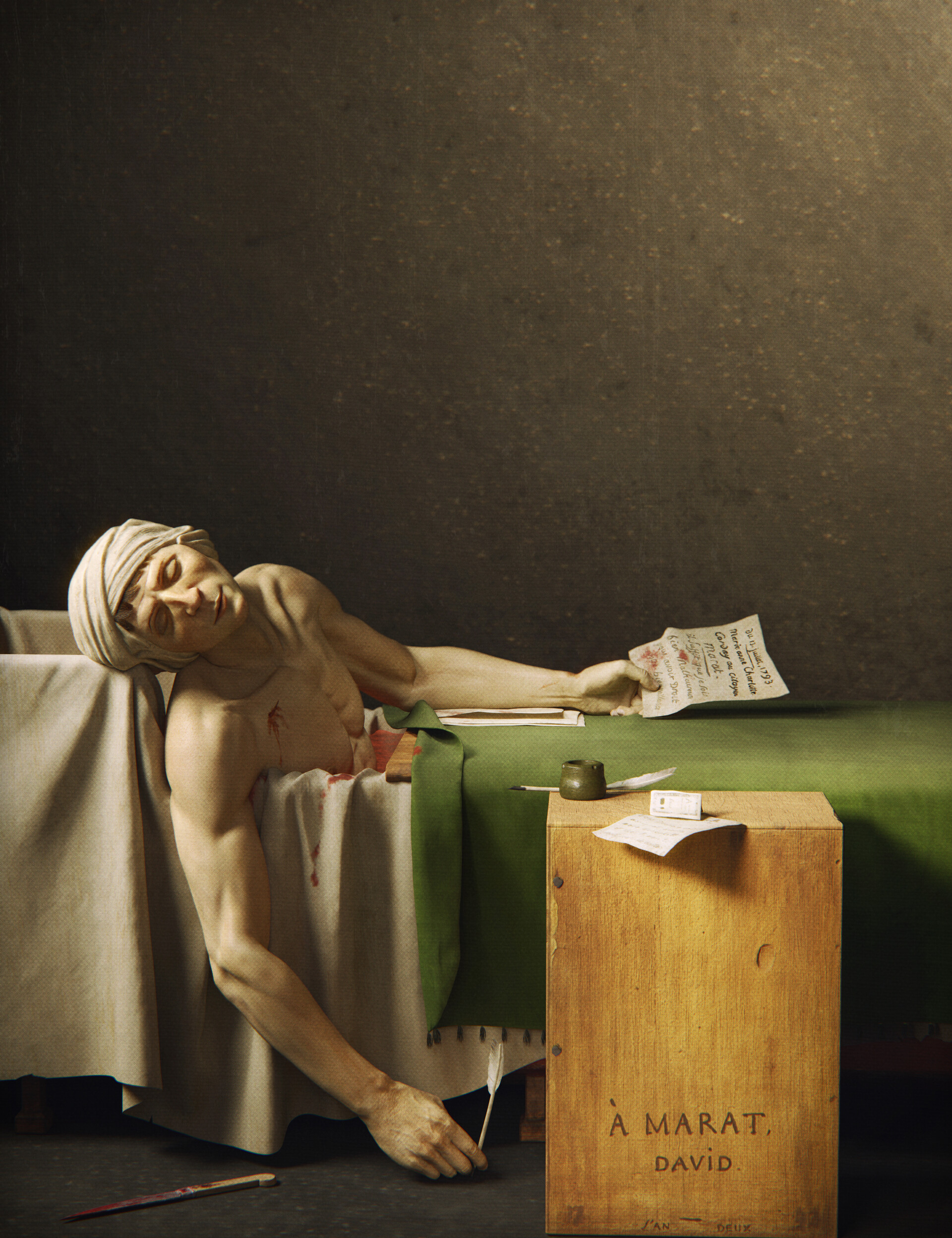
Beauty Shot

This project was inspired by my admiration of the most famous neo-classical painter during the french revolution era: Jacques-Louis David. I listened to a lot of lectures, read several essays, and read the free pages on the book "Emulation" by Thomas Crow which are available in google books. I discovered David from a video from the youtube channel Nerdwriter (https://www.youtube.com/watch?v=rKhfFBbVtFg). I found it really interesting on how David use painting as a medium to tell a story, both from a compositional point of view and from looking at his current life stages.

I found that David, grossly simplified, roughly 4 stages of life: 1) His academy days, 2) His contribution on the French Revolution, 3) His role as the first painter for Napoleon, and 4) His last days in exile. Looking at when he paints certain pieces is really interesting to me. From "Oath of Horatii" to his last painting "Mars Disarmed by Venus and the Three Graces", you can see a gradual shift in style, ambition, humility, and especially his ever-changing ideology.

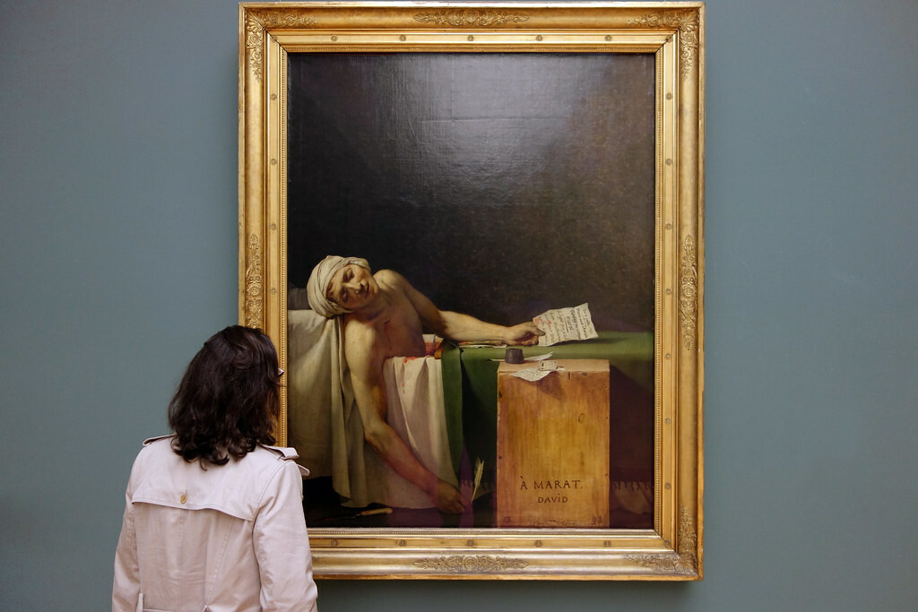
Original Painting in Musée Oldmasters Museum 

This project was supposedly a part of a bigger project which I have decided to not continue. It was simply too big for my current skill and the time that I have. Choosing Marat seems like a reasonable compromise. 

I tried to re-create Death of Socrates at first. It was too ambitious.

Marat was one of, if not, his most famous painting ever. This was used as a propaganda machine during the french revolution days. This painting is revolutionary in both senses: as a revolution for the republican French, and (more importantly in my opinion) as a depiction of a contemporary figure. Before this painting, David has always painted images of people in classical antiquity. These kind of iconography is usually reserved for religious martyr such as painting by Caravaggio (https://en.wikipedia.org/wiki/Caravaggio) (He died at 38 holy shit) and other Renaissance painter. By painting Marat, a hero of a revolution who was killled by Charlotte Corday, a royalist, David is trying to heroicize the idea of the revolution. 

The image is really interesting because of the contrast in the image itself. The detailed, confident brushwork foreground is contrasted strongly by the empty, nearly soft background; the neo-classical style of the painting itself strikes a contrast with the rococo style which predecess the neo-classical era. In which in rococo it is about the life of the noble, the royalty, and the ideal life of what a royalist should be, while neo-classical feel grounded, rational, almost hyper-real in its way on conveying its emotion. These theme of David revolutionizing his style fits really well with the theme of revolution because in this era, French is trying to secularize itself by removing all sorts of old/traditional stuff from the old generation, to a more rational approach (for example the switch from imperial system to the more rational metric system). There's a sense of harmony in all these narrative tying the images of Marat, the revolution, David's ideology, and his painting style in spite of the contrast in all the story inside it. And I found it interesting enough for me to make a project about it.

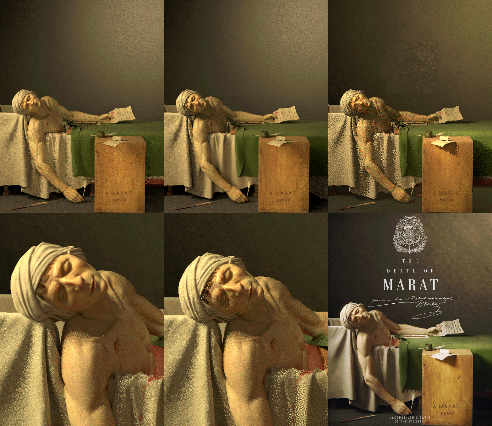
Beauty Shot - Poster Style (with the Jacobins Club logo I found on the Internet)

I have always wanted to create a full emotional scene in CG ever since I lay my eyes on Flamenco by Borhan a few years ago (https://www.zbrushcentral.com/t/flamenco/205886), and this is my first time of making it. I have always seen this kind of project as something really scary, and it feels kinda refreshing that it feels just like any other project I did before: full of cycles of chaos, relief, acceptance, and so on and so on. Although in a really small scale compared to the likes of Andor Kollar (https://www.artstation.com/artwork/EVrZJe), and Farzad Maleki (https://www.zbrushcentral.com/t/the-raft-of-the-medusa-theodore-gericault/343249). These guys are awesome.

Detail Shot 2 - Poster Style 2 (with etched illustration effect)

Analyzing the Master

I learnt a lot from doing this project, especially from a lighting point of view. I am gradually shifting from lighting a single character with a basic 3 point-lighting to a more story-telling based lighting within an environment. I would like to make my own level design/environment project in the future with unreal engine. Analyzing how David light his painting is pretty interesting, specifically in The Death of Marat which I mostly focus on.

A few things that I try to always keep in mind when lighting the character:

1. Look at the Lines! Zig-Zag, Parallel and pointing at something.

Although this point is not strictly lighting, I adjusted the model position and the shape of it based on the lighting in many cases. In my observation, a lot of David's work use lines as a method of storytelling. Lines created from the human gesture, shadow shape, clothing folds, light, and many more. One key feature in David's work is that he paint his composition in a simple, flat, almost 2d way. This is most prominent in his painting "The Death of Socrates" (this video explains this a lot better than i can https://www.youtube.com/watch?v=rKhfFBbVtFg).

In "The Death of Marat" I try to analyze the painting using the same method that I found in the video above. And what I notice is that a lot of lines are pointing at Marat as if trying to tell us "Look at him. See him. Focus and put your gave upon him", which makes sense as that is the purpose of this painting. 

His pose, not only trying to mimic Jesus being brought down from the cross (I forgot from which specific painting, but pretty easy to find in google), also has zig-zag lines in it. It is pretty strong and obvious because of David's way of laying things flat in 2d. Zig-zag in what I have watched in some environment/level design tutorial video is really strong and should be used to bring the gaze of the viewer to the focal point.

As for the perpendicular lines, personally for me it brings structure to the whole piece. It is showing that even in his death Marat still believes in the ideals of revolution and so should we. In shape language, square and perpendicular shape is synonymous to the expression of strong, steady, and solid. So I think it makes sense. I play around with the camera angle a lot making sure the wooden table left side is invisible, making it seemingly blend into one straight line.

2. See how the background is being used to show story in the piece.

3. How harsh the shadow is (the harder he shadow is, the smaller the light is. The opposite is true)

4. How big is the falloff of the light (the bigger the falloff, the farther the light is from the object. The opposite is also true)

It took me quiet a while to understand this. Previously I always assume these 2 things are the same, mainly because I always save myself by increasing the intensity of the light. Understanding these 2 things provides me with a strong foundation in my mind when I am doing lighting. I can't wait to apply this simple principle in my other projects. 

The rest of the light breakdown is coming soon in my breakdown post

Although for the shadow softness, it also depends on the distance between the object and its shadow. The farther away it is, the blurrier it gets, You can check this by putting your hand on top of your other hand in a well-lit room, and slowly move it away from each other. You will see the shadow gets blurrier and blurrier.

Point 3 and 4 derived mainly from this awesome presentation by Ian Spriggs in gnomon youtube channel: https://www.youtube.com/watch?v=nI-HE2tBoDo

Knowing that light fall off and soft shadow is a different concept is really mindblowing for me. I always thought the 2 are the same thing. If I want to make it more dramatic, driven, focus, and full of energy I can make the shadow sharper by making the distance farther, or make the light size smaller. If I want to make the scene more warm, cozy, intimate, and lazy I can make the distance closer, and the light bigger so the shadow blends in nicely. Usually my lighting always reside in the middle of those 2 concepts. But finally after knowing this I think I can be more confident in my lighting process.

Character Creator 3

For this project I decided to use character creator 3 for the first time. I downloaded their free trial, and decided to test out their product. I use CC3 mainly for: 1) Ready to use Color, Normal, and roughness map, 2) Easy posing with HumanIK in maya  (using this tutorial https://www.youtube.com/watch?v=Ult2b3z8ySw skipping the 3dexchange step), and finally 3) Multiple character possibility (in which I decided not to pursue).

After exporting the basics character, I then proceed to ZBrush to continue refining the volume and form. At first I made a generic base character anatomy first. Then I change the shape of the face and the body so it resembles more of Marat. This is my first time tryinig to sculpt likeness of a person with no photograph. I managed, however, to find Marat death mask, and several other painting of him. His face is quiet distinct making it pretty easy to achieve likeness this time. Although i get kinda lazy and decided to just proceed to lighting the character as fast as possible.

Making Props

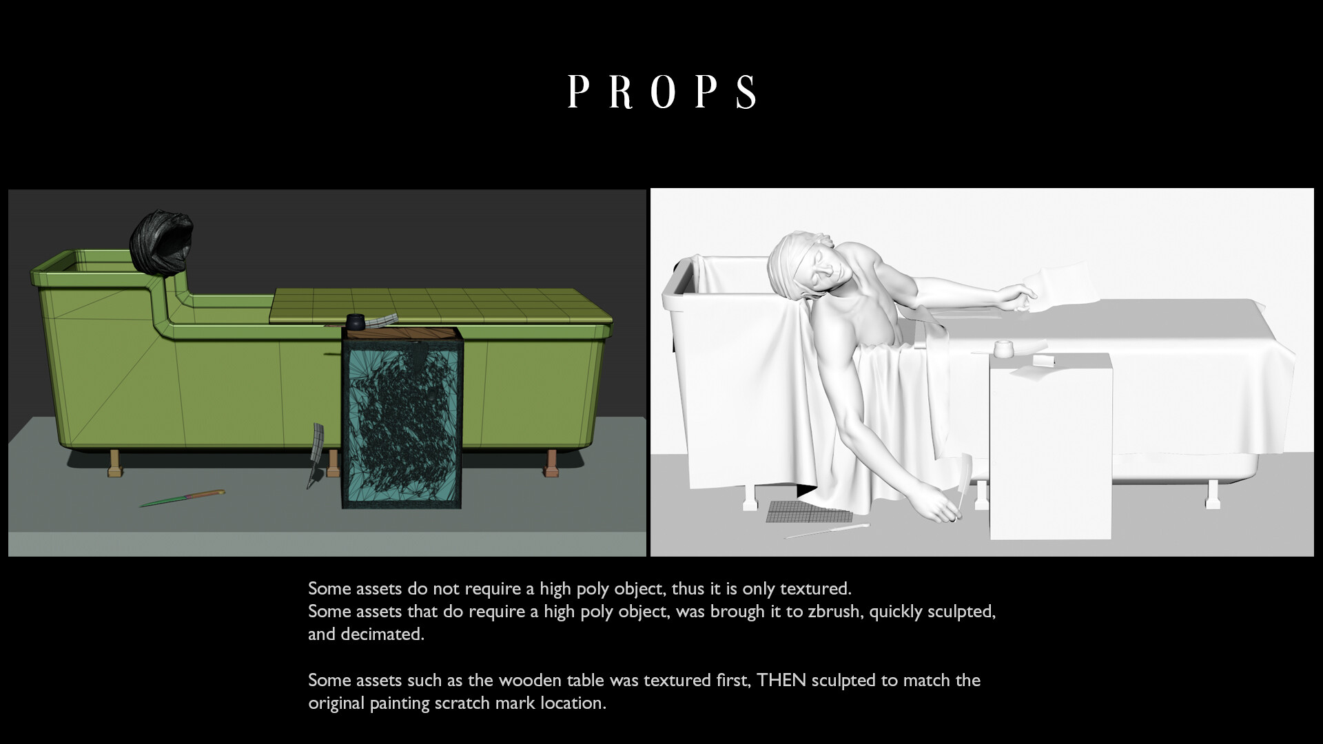
I use marvelous for a quick cloth blocking. It is just a simple rectangle which I simulate on top of the bathtub.

Not a lot of time was put on the props if I was being honest. The most important part of this step is the material definition later in the texturing phase. Other than that making the props in this project is relatively simple and straightforward.

After posing and blocking out the props, I proceed on sculpting the details on Marat and several other stuff that needs a high poly object.

Texturing

Texturing the skin was particularly fun. Because all the important maps is provided from CC3, I can easily lookdev it quickly even before I start texturing. I use a combination of noises, cavity map (from Ian Spriggs Gnomon video stated above) to increase the details of the specular, roughness, and scattering. This method of painting the maps is really fun and full of freedom. I am basing specular, roughness, and scattering grey level from Project: Xu, Ian Spriggs Video, and a lot of my personal skin reference. I did not use Mari this time.

Detail normal was also added using aiLayerRGBA with tiling value following what CC3 provided. It is however a bit too small for my liking, so I make it slightly bigger.

Lookdev (Lighting + Shading)

Lighting Marat was really interesting. Usually you light a character to make it feel alive, but this is lighting a dead character. Although 90% of the work is recreating the mood and feel from David's painting, I try to be conscious of the location of the shadow, and make sure it's not too soft. The light and shadow have to be contrasting one another. I explained lighting in-depth in "Analyzing The Master" section above, and Shading in this proejct is super super simple. I didn't even use any UDIM this time. So here is a GIF on my lookdev process (arnold snapshot) from start to finish, Enjoy!

Compositing

I did a simple multi-pass compositing in blender, especially to remove the RGBA_wall AOV from the wall_light on the hair. I did some color adjustment too on the Key light. For some shots I use the defocus node to blur the edges a bit.

The rest I did in photoshop, applying: chromatic abberation, halftone pattern, some grunges on top, a lot of adjustment layer, etc etc. I include in the breakdown a simple trick that I use to make the shadow and highlight a bit different. I apply halftone pattern which is more obvious in the shadow, and gradually fades when in goes to the highlight. I think it really sells the texture of the final image.

If you have reached here, thanks for reading this awfully long blog post :> This project was a lot of fun, but now I really want to move on already. Thanks for reading and I hope you can learn a few things along the way. Again thanks for reading :>

Art History is Rad.

Poster Style image is inspired by Hamilton poster.

Further Reading

Quick youtube video about Death of Marat by SmartHistory

https://www.khanacademy.org/humanities/renaissance-reformation/rococo-neoclassicism/neo-classicism/v/david-marat

Emulation: David, Drouais, and Girodet in the Art of Revolutionary France, by Thomas Crow
https://books.google.com.sg/books?id=tM76jORspU8C&printsec=frontcover&source=gbs_ge_summary_r&cad=0#v=onepage&q&f=false 

The Legacy of Jacques Louis David (1748–1825), by Kathryn Calley Galitz
https://www.metmuseum.org/toah/hd/jldv/hd_jldv.htm 

Presentation: Jacques-Louis David (French, 1748-1825), by Micah Christensen
https://www.youtube.com/watch?v=o28vgnNzNpc 

3D Portraiture: An Evening with Ian Spriggs (I watched this during my rendering phase it it motivate me to keep doing this project)

https://www.youtube.com/watch?v=nI-HE2tBoDo

A good article about Rembrandt lighting study

https://www.videomaker.com/article/f03/18351-a-study-of-rembrandt-style-lighting-from-the-three-point-perspective

Making of "Project: Xu"

Making Of / 04 May 2020

Final Render: https://www.artstation.com/artwork/k4YByx

Hello everyone, this is a further reading of my process in my latest project "Project Xu". I wrote this blog as I was working on the model itself, so if I encountered a certain problem or found a nice tips, I immediately wrote it down here. Some sort of a "working memo" along the project if you may.

This project is based on an artwork from one of my favorite character illustrator since 2 or 3 years ago Jinglin Xu (https://www.artstation.com/xujinglin). I was looking at some of his old stuff when I saw this: https://www.artstation.com/artwork/qEVle. At first it was the interesting framing of character that caught my eye, and the red hair seems quiet fun to do. It has a decent amount of details also and it seemed perfect to do in YCF style (that crazy good Chinese 3d course). 

There is a story that I want to tell with this piece. And that story is a simple "a cool/fierce girl standing looking at something".

The Goal of this project is to have a render done as fast as possible from scratch, using Chao Dong's (https://www.youtube.com/channel/UCC-rjGYsVFrcTlVov4CAXtQ) presentation video as a guide (free version). 

I had a whole month off from work because of MCO (movement control order) in Malaysia in response to Covid-19. Because of this I managed to finish this project in roughly 1,5 months.


Breakdown


Modeling

I start this project with my previous abandoned project base body (https://www.artstation.com/davinsaputra/blog/3MqN/helena-wip-01). I made a lot of adjustment primarily towards the face as the previous model was geared more to western facial feature. A lot of proportion adjustment were made along the way too.

For the props, nothing particularly complex, most of the props was made in zbrush except a few part which was made in maya and blender. I have been learning blender for a few months now and this project is a good learning experience too.

Creating Bandages

Final High-Poly from Zbrush

Posing

I used mixamo to automatically rig my base body. I download the skinning test animation, and make a frame with the final pose. After that I paint skin weight on some area that distorts a lot in the final pose.

I made a blendshape between the A-Pose and the Posed model (the final pose for the base body was modified in zbrush too). Then I wrap deform every object one by one, and manually moved all the props into place. 

I found out that using the base body as the target of wrap deform is really heavy. So I decided to make a quick proxy using polyRetopo; command in MEL, wrap deform that to the main body, and then wrap deform the props to the proxy.

This is NOT the best workflow for this. I did not retopo my model whatsoever, and all my topology is the result of ZRemeshing. This took quiet a while as my Maya crash quiet a few time. In the end, I fix a lot of distortion in ZBrush.

Using transpose master was key in this phase. One thing i found out during this process is that you cannot use zbrush gizmo deformer in transpose subtool phase. Somehow it destroys the vertex order. Which is a shame because using lattice to adjust proportion is a really nice thing to do.

EDIT: I just found out about character creator 3, making this workflow obsolete im my opinion. Haven't tried that software though. Definitely gonna try and utilize that software in my next project.


Texturing

Texturing is quiet straightforward. I use substance painter for general texturing, and Mari to project albedo map and displacement map from texturing xyz onto the skin. Because I will not be using displacement map during this project, I just simply put the displacement map to substance painter as a height map. The tattoo was also made in substance painter using a combination of crystal node, warp, erode, and blur.


LookDev

For this project, I utilized LookDev Kit 2.0 plug-in created by Dusan Kovic (https://www.artstation.com/marketplace/p/jVDY/lookdev-kit-2-0). It's a great plug-in and I highly recommend it for lookdev purposes. It makes a lot of simple thing such as turning on object subdivision during render on, making turntable, and my favorite: changing camera focal length, aperture, and sensor size (full frame, APS-C, or micro 3/4). It makes lookdeving like taking an actual photograph and it makes it really fun.

Lookdev-ing is one of the more tedious part of this project. Jumping back and forth from maya, to zbrush, to substance painter could take a lot of time. To make my workflow faster, I made a photoshop file specifically for liquifying my model to fix the proportion.

I also add an AO layer which I extract from zbrush -> polypaint -> convert to texture. I make a shader with opacity map and diffuse only. Another transitional mesh between the eye and the skin was also added for extra realism. I am following a tutorial made by Vadi Sorici mostly for these steps for the eye (https://marmoset.co/posts/how-to-create-realistic-hair-peach-fuzz-and-eyes/). Although it is in marmoset it translate quiet well (except refraction, I still have no idea how to achieve perfect eye refraction in arnold).


Hair (XGen IGS)

I spend around a whole week playing around with xgen. I tried to use core xgen at first using curves from the 3d hair imade in zbrush. However the results is undesireable. I decided to use xgen interactive grooming, and I am really happy I decided to shift course. One important thing I didn't know before is XGen IGS used GPU for it's calculation, making it a joy to work because what you see in the viewport is what you get in the render.

video from TheSalonGuy: https://www.youtube.com/watch?v=n5MqNEcIW88 

XGEN Troubleshooting

1. Enabling "Use default material" toggle in Maya status bar will remove XGEN hair visibility in the viewport (Core XGen only, not IGS). This took me like an hour to figure out

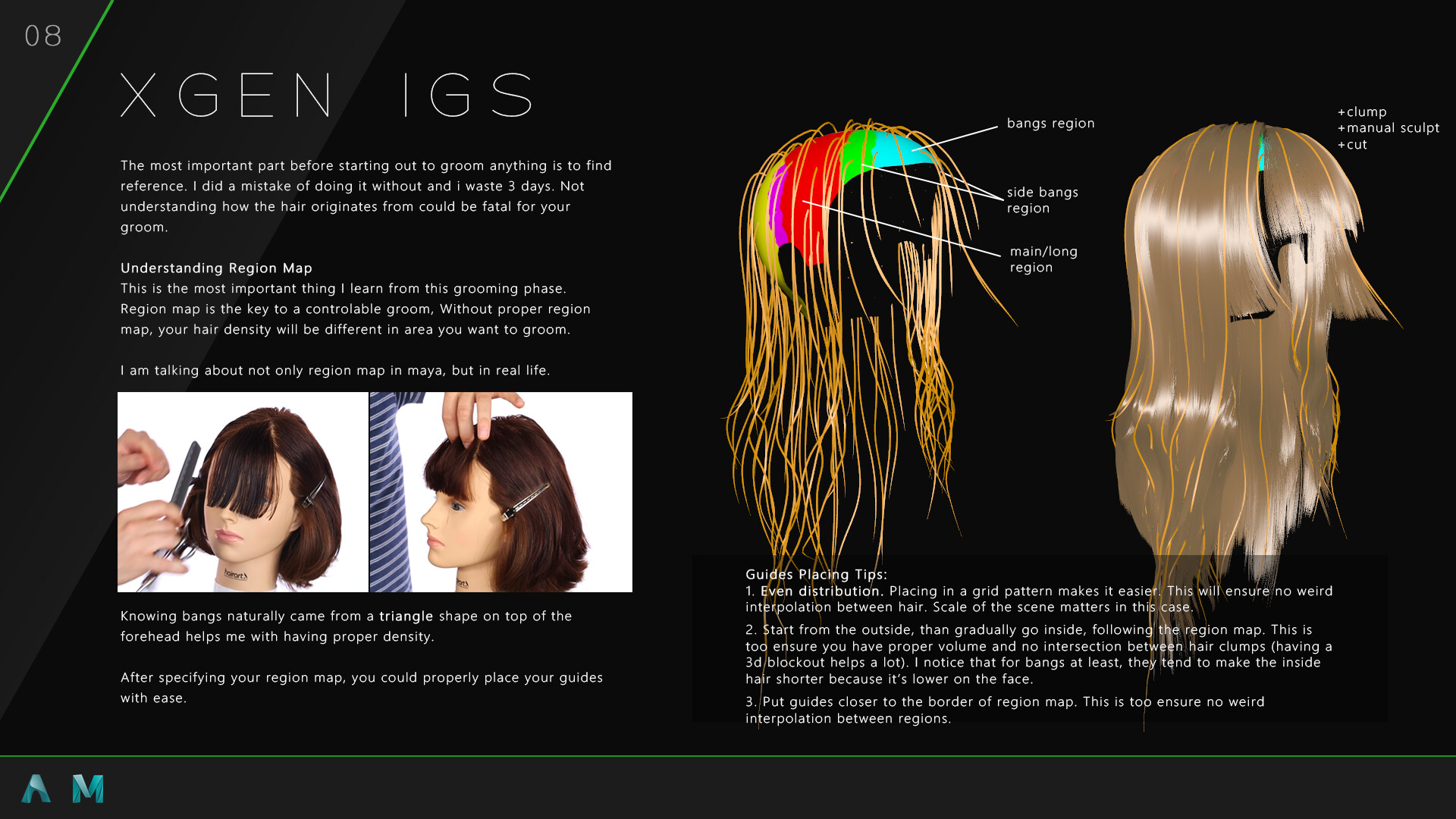
2. XGen IGS: if your hair doesn't load, try re-editing your density mask, and save it again. I found this quiet helpful in refreshing missing hair (usually happen everytime I save maya file, really annoying).

3. XGen IGS: in most of the brush, theres a "filter backfaces" checkbox. This really helps when you are making shapes of the guides on while orbiting the model in weird angle

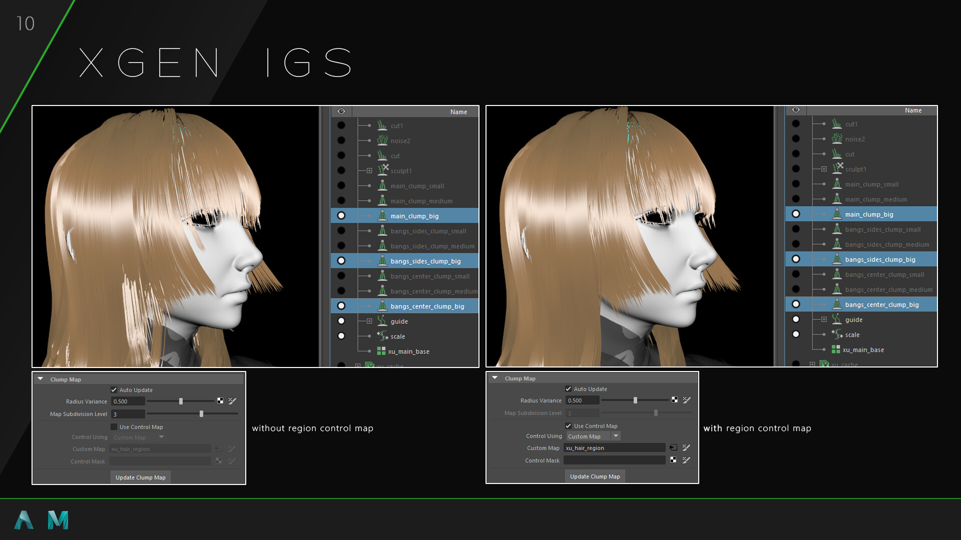
3. Xgen IGS: if you are using region mapping on your guides modifier, connecting region map in guides modifier into custom control map in your clump modifier is really useful to create clean big clump. (https://knowledge.autodesk.com/support/maya/learn-explore/caas/CloudHelp/cloudhelp/2017/ENU/Maya/files/GUID-809D1ADA-4D78-45E5-9900-9997089DFC3F-htm.html ) Then, using the big clump as a control map for smaller clumps modifier makes the smaller clump tidier (see breakdown)

4. XGen IGS: using the color black in region map, will break the region map for some reason

5. XGen IGS: after changing hair CV count, do not undo. It will explode your hair. Luckily redo seems to work just fine

6. XGen IGS: I have several occurence of corrupted maya file. I found out that if my maya file is over than 300mb, my file cannot be opened anymore. To reduce the file size, i cached out my hair -> make a new file -> make a new IGS description -> apply a spline cache modifer and import the exported cache. This really cut back on file sizes. However this method has its own drawback

7. XGen IGS: try not to use too many sculpt layers. It dramatically increase file sizes.

XGEN Problem

1. XGen IGS: i tried this method of guide clumping based on this thread for days (https://forums.autodesk.com/t5/maya-forum/xgen-interactive-clump-input-points/td-p/8441320 ). But I still can't get it working on my file. It works fine on a simple sphere but on a complicated model it doesn't seem to work...

2. XGen IGS: applying noise modifer or clump modifier after "Spline Cache" modifier doesn't seem to work. That's the main reason why the final render doesn't have an overal noise applied to it.


Rendering

I use arnold in Maya for rendering. Everything is pretty straightforward. I try to understand more on how each and every function work by reading the documentation in arnold more closely this time. I experiment a bit with Adaptive Sampling, but in the end the render took too long for it to work. Thinking back on it, I should probably reduce the camera sample to 1, and set the adaptive sampling to 3. Before this, I put the adaptive sampling to 5 and camera on 3, resulting in t over 9 hour of render time (which crash when I was saving the exr lol), while no adaptive sampling took only over 4 hour. I dont have enough time so I just disable it for this project. 

Specific Region Iteration

During the final phase of the rendering phase, my housemate gave me an advice about the nose being too high and the texture of the hand looking more like a leather than a birthmark/skin defect. I am baffled on how did I not noticed that. However I really want to finish this project as soon as possible, so rather than becoming a perfectionist and render everything again, I decided to just render those specific region in Arnold Render View, and merge them together in Natron. Although it may seem really simple, this is a common trap that I have fallen into many many times. During my Artstation Challenge on my Lion project, I keep re-rendering the whole thing eventhough I only change a few things in the scene. Everytime I keep reminding myself "this is the last one".

Doing this really gives me the courage to just be more free in general in tackling my own workflow. Workflow should bends to the will of the user, not the other way around.


Compositing

On my first try, I used Natron to compose all the pass together, and Photoshop to do some touchup. Natron is really really laggy. I had just found out that development has been abandoned while I was working with it. I will try to find other alternative after this. I had a lot of hang, bug, and general annoyance during this process.

Later I found out that you can do multi-pass compositing in blender also. I had always knew this but I didn't know you can just drag your open EXR file to the compositing editor and work from there. I did my best to replicate my previous compositing work on Natron in Blender. And it is really a joy to work with blender. Although the UI is not super optimized for compositing work with a lot of render passes, for a compositing a single frame of character, it works marvelously.

I bring everything to photoshop to tweak the final result. I don't use a lot of Depth of Field as i want the main focus is the character. That's why unlike my old works, I did not apply vignette, film grain, or any other applied texture on top.  I want something a bit more clean and minimal.

Compositing Tips and Tricks

1. Sometimes things look CG because the black is too black. So lifting the black could help sometimes. It also have a film look to it according to some youtuber. Make a new layer -> fill it with dark grey (not 100% black) -> change blending mode to lighten -> adjust opacity


Conclusion

This was a really fun project to do. This MCO brings more good than bad to my local social circle here in Malaysia. It enables me to relax, chill, and do a project with a relatively quick pace such as this one.

Making and designing a blog and breakdown like this is genuinely a fun and creative work. It reminds me of designing high school presentation. It is really fun to do this kind of stuff and again. Ultimately, it is a learning experience going back through all your progress and reminding yourself with what could you have done better in the future.

Character Breakdown post was inspired by Guilty Gear Strive universally hated new battle User Interface. 


Others


Schedule scribble 

IGS clumping scribble

Making Of "Climber"

Making Of / 12 January 2020

I upgrade to Artstation Plus just because of the blog feature. I thought this is a fun way to share some of my WIP project without the burden of creating new project everytime. I just read a Steal Like an Artist book that my friend lent to me. And in one of the chapter they told me to "Write what you want to read". And I really love reading this kind of breakdown of a project in 80 LEVEL back when I was a student (hopefully I got back to those again now).

Introduction

This project started out of nowhere when I had an idea to sculpt my friend Chi Kit (https://www.artstation.com/kidd555) doing a cool rock climbing pose. His wedding day is around that time and me and my friends want to make something cool to give him on that day.

I know from the start this project is gonna be a rushed one, so I thought maybe I can do some kind of Daily Progress for my own personal project, that i can look back upon to see, judge, and cringe at.

This project can be summarized into 4 steps: blocking + reference -> posing -> detail -> merging

Ewww 

I'm sorry that you guys have to look at that. It was day 1 in blocking, and looking back I am really impressed on how I didn't just run away and abandoned this project altogether. 

I had just found this youtube channel (https://www.youtube.com/channel/UC_JzGeCHnGFHLFWynzX4zhA), and his channel is the one that really gave me the confidence to took the first step. I tried blocking using his method and although proportion wise it's whack, it's a pretty fun way to block anatomy.

day 5 - by this stages, I am still gradually collecting more and more references while thinking of what the final pose is going to be. Proportion is also still really whack. I am still constantly adjusting the proportion even until detailing phase.


 day 11 - he now wear pants. At this stage, the head and the body is still separated. I like working this way because I adjust the face a lot as I am still not certain about his expression in the final pose.

Posing

I start out by using ZBrush defauly mannequinn to figure out some of the poses that I like. I decided to use this cool picture of Tomoa Narasaki ascent pose that i found in google.

The shutterstock watermark really scream professionalism to me. This pose has so much energy and at the time I thought i could add a chalk bag swinging as a secondary action from his waist (spoiler: i completely forgot about it. I just remember about it when I'm typing this blog)


day 15 - overall proportions is still whack. I'm still trying to figure out the pose.

day 18 - I found out that the torso is awfully long. It is obvious looking at it now, but back then I have no idea what is wrong with it. Some changes that I made in this stage: shorter pecs, shorter abdomen, less muscle volume overall

Detailing

day 22 - detailing the model which include breaking the symetry and a lot of face adjustment. The body and the head is still separate. I use posable symetry for the head so i can still sculpt on it symetrically

I start to design a base with a wacom pen holder on it. This was meant to be 3d printed, however it was scraped due to the high cost and time constraint.

Final Result


I merge the head and hands with the body, zremesh it and project it back. I tried doing the final render in arnold for a couple of days, however i decided it looks better in ZBrush BPR render instead.

Overall it was an awesome project. A lot of mistakes were made, and i think I learn quiet a lot. Hopefully some of you had fun reading this blog as I had a lot of fun (and cringe) writing this blog.


Extra: Postcard

I did a quick texture in substance painter, and i use the default IRay render in Tomoco Studio. Took it in photoshop, and play with it for hours. It was probably the most fun part of this project.

I took the Chinese version of Captain America winter soldier poster, and crop it for the big chinese text which means captain.